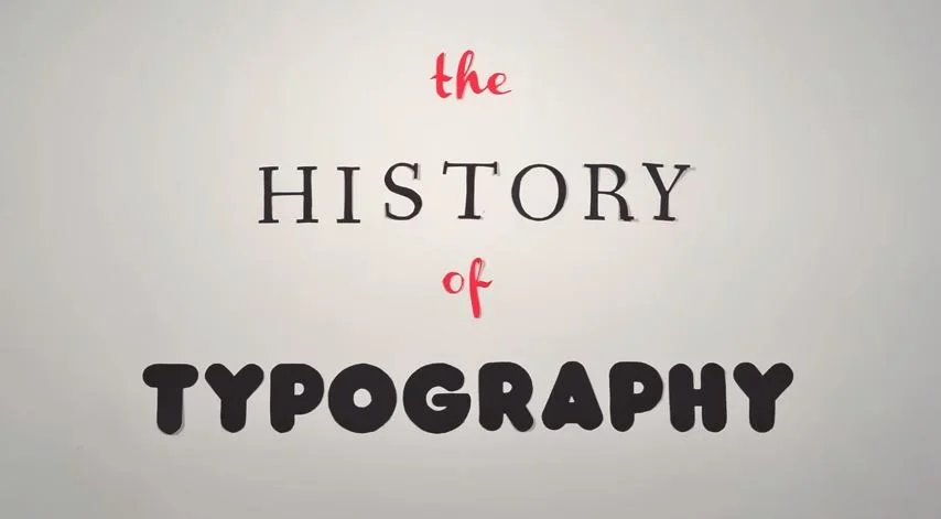

I find this simple stop-motion animation about the history of typography to be really charming. Created by Ben Barrett-Forrest of graphic design company Forrest Media, the clip is composed of 291 paper letters displayed in 2,454 photographs, and represents 140 hours of work.
What I find most appealing about Ben's work is that, in a time when digital typographic animations are so quick and easy to produce, he has taken the time to craft something by hand. In doing so, he has created an animation which is raw and imperfect, and in places somewhat clunky. But it also has a feeling of being real and tactile, a hand-crafted work of typographic animation which mirrors the origins of the medium it chronicles - the painstakingly hand-made and imperfect way in which type was made and arranged for printing.
The clip is informative and entertaining, but it is its raw imperfect charm which I find most appealing, and why I recommend that you give it a watch