The Dream of Ink: UNHIDE Conference

Comment

The Dream of Ink: UNHIDE Conference

‘The Dream of Ink’ is a beautiful animated short, put together by the amazing Lightfarm Studios for the opening of the UNHIDE Conference, the first event focused on Digital Art in Brazil. Directed and Produced by Rafael Vallaperde, the short is the journey of a little girl made of ink through a phantasmagorical inky world.

I love the art style of this piece, and the way the use of colour, the character design, and the beautiful fluid simulations all support the aesthetic and the story being told.

Also, check out the video below for a short behind-the-scenes look at what went into making this film.

UNHIDE Conference took place in the city of São Paulo, Brazil, 2nd-4th November 2018. It was hosted by the UNHIDE school of digital art.

Comment

2001: A Picasso Odyssey

Comment

2001: A Picasso Odyssey

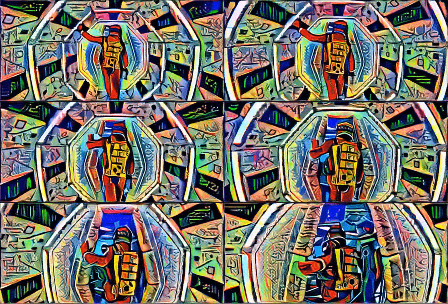
Artist Bhautik Joshi has been running footage through Deep Dream, Google's trippy image making software, transforming the film into a vivid cubist spectacle. The images are generated using Deep Dream's deep learning algorithms, which can analyse image data and apply the style of one image to that of another. It is the technique that is at the heart of Google's image recognition tools, and their project to teach computers to analyse images and distinguish their content. But it also offers artists unique opportunities to create fascinating projects that fuse art and technology in surprising ways and generate compelling imagery that would be difficult to make using conventional means.

The footage that Joshi has chosen, from Stanely Kubrick's 2001: A Space Odyssey, is a perfect choice for this kind of treatment. 2001 is a film with a very clean visual design and bold, striking, and very recognizable images. Looking at Joshi's clip, you immediately know what the source material is. But the film is the story, at least in part, of humankind's relationship with technology, and to see it presented this way - at the cutting edge of where technology meets artistic expression - adds another layer of complexity to the subject material.

Joshi has also created a somewhat creepy video by feeding footage of Donald Trump's face into Deep Dream and fusing it with images of food, bullets and even teeth. Its a little disturbing, but it by showing the before and after footage the clip below helps to explain how the Deep Dream technology works.

madmax_3370396k.jpg

Joshi isn't the only person using Deep Dream to making fascinating images. A number of artists have been feeding strange combinations of pictures into the software and generating some weird and compelling imagery. But he is the first person that I have seen creating images with such strong visual cohesion, and also the first I have seen to create video.

I'm fascinated by this, both the technology and its creative potential. I look forward to seeing what will come from it.

Comment

Method Design - AICP Sponsor Reel 2016

Comment

Method Design - AICP Sponsor Reel 2016

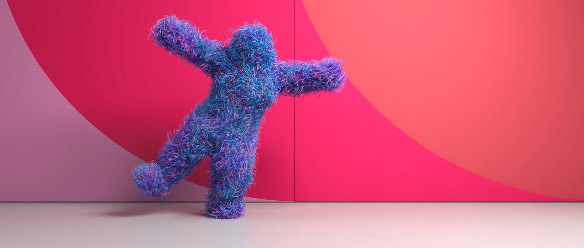
This VFX dance spectacular from Method Design must have been a dream job for the Houdini effects artists. Method was hired by production company RSA to produce this years AICP sponsor reel. Using motion-capture driven animation and dynamic simulations, the short playfully represents the AICP sponsors as dancing avatars.

I love this video. It's visually engaging and has a huge amount of energy, and the simulations are really creative. I'd love to have worked on this project. Congratulations to everyone that did.

Comment

Ready Player One Fan Art Poster

Comment

Ready Player One Fan Art Poster

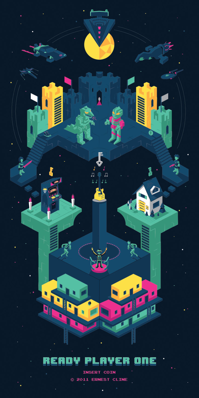
The novel Ready Player One by Ernest Cline is a fun nerdy romp through 80's pop-culture nostalgia, but given that its target audience is comprised of the kind of people who would love related merchandise, there has been a surprising lack of tie-in products. This will likely all change with the release of the Steven Spielberg movie adaptation, but until then we have this great piece by Harlam Elam, who was commissioned to produce a limited edition screen print inspired by the book.

I read Ready Player One shortly after it was published and fell in love. I really connected with the story and all of the incredibly nostalgic references so naturally I couldn’t resist creating this tribute piece.

I wanted the art itself to look like a 3 tiered game inspired by Monument Valley in order to reflect the core themes of the book. I had great fun stuffing the print with as many relevant pop-culture references as I could.
— Harlam Elam

The piece is full of lovely little details and references, which fans of the book will pick up on, and each one has been signed by Cline himself. If you want to get your hands on one, head over to Elam's twitter.

Sketch to final piece

Sketch to final piece

Ernest Klein signing the artwork

Ernest Klein signing the artwork

Comment

Marvelous Designer 2015 showreel

Comment

Marvelous Designer 2015 showreel

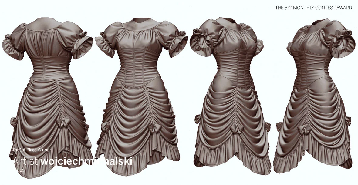
Marvelous Designer has unveiled its 2015 showreel, demonstrating it's CG cloth and tailoring software. It looks like its capable of some impressive stuff. I'd be very interested to see whether the tool can be integrated into a high-end VFX pipeline and used on some of the top-tier projects going forward.

Comment

How memes evolved

Comment

How memes evolved

Chris Plante from What's Tech has put out this short podcast on the history and evolution of the internet meme.

Starting from the earliest known memes, such as the dancing baby above, Plante and Adi Robertson discuss how memes have evolved, their role as both inclusionary and exclusionary in internet culture, and how internet memes differ from Richard Dawkins' meaning when he coined the term. Its a brief discussion but a fascinating one. Read the full What's Tech article here.

If you want to know more about specific memes, check out knowyourmeme.com, which has a database of thousands of known memes with some of the history and origins of each. If you want to get deep into your meme history, its a good place to go.

Comment

Mark Bakowski talks Spectre

Comment

Mark Bakowski talks Spectre

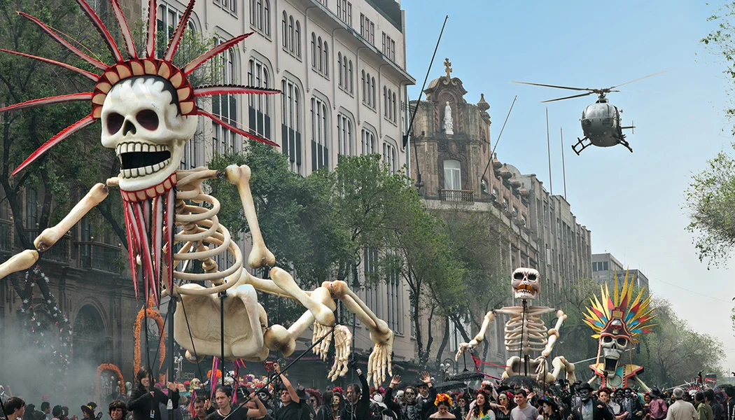
An incredible amount of visual effects work went into the opening shot which comprised of 6 different plates shot in both Mexico City and at Pinewood Studios and totaled around 6’000 frames. The shot work included large crowd simulations, digital matte environment extensions, prop additions, rig removal and cleanup and digi-doubles.
— Mark Bakowski, interview with Art of VFX

Mark Bakowski, VFX supervisor at ILM London talks to Art of VFX about the work done on the new James Bond epic Spectre. Mark talks in great detail about the often invisible VFX work done by the ILM team, particularly on the spectactular Day of the Dead sequence in Mexico, which has been getting a lot of attention in reviews of the film. He also explains how the 5 minute opening shot was stitched together from 6 different plates, and augmented with lots of digital effects work to create the compelling start to the movie. 

The Mexico City environment was a fully digital asset created by the Generalist department at ILM London.
— Mark Bakowski, interview with Art of VFX

I had the privilege of working as a compositor at ILM London on Spectre for around 8 months, working under Mark's supervision. Indeed this is the fourth project on which I have worked for Mark Bakowski, but Spectre was a particularly interesting project to work on. The compositing team was fairly small, and we had a large number of very complex shots to deliver, so it was a fast paced and challenging show. But Mark, and compositing supervisor Dan Snape, made for a great supervision team, ensuring that the work we delivered was consistently of a high standard. As a junior compositor, it was a great experience to be working on this project and I learned a great deal and developed a lot as an artist. Plus I got to composite some great looking shots, and work on a film which has been very warmly received, which is always a plus.

Never underestimate a retime! But you live and learn….
— Mark Bakowski, interview with Art of VFX

Comment

Star Wars Sky Movies Promo

Comment

Star Wars Sky Movies Promo

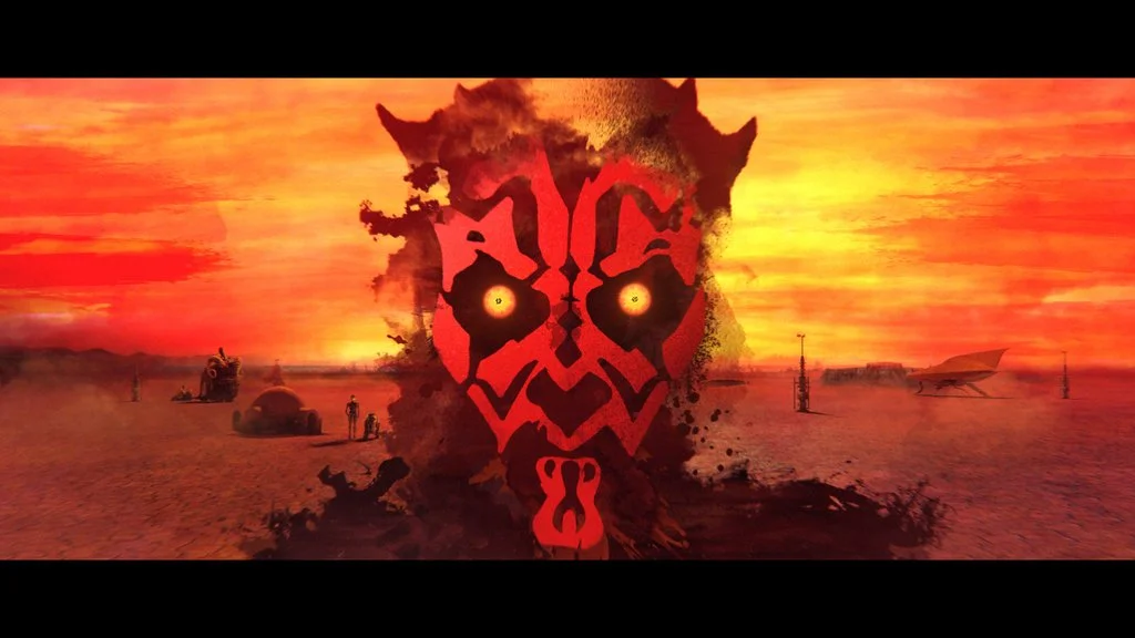
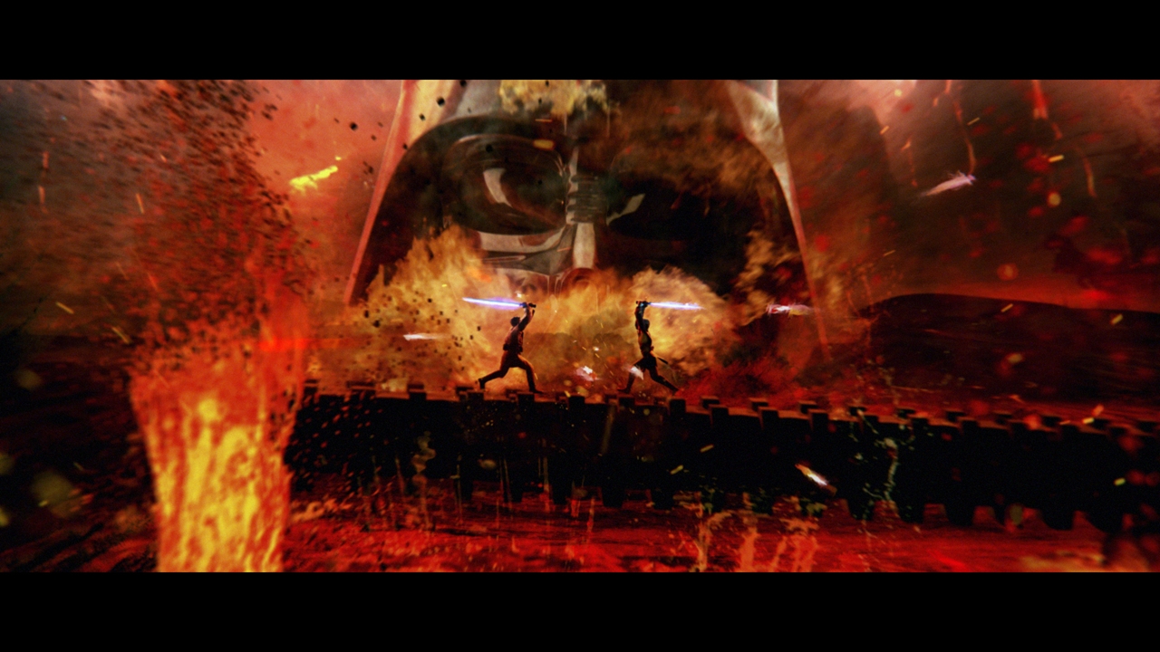
In order to get you ready for Star Wars Episode VII, Sky Movies is screening all six Star Wars movies, which you can watch back-to-back. To promote this, MPC Advertising have produced a stunning 30 second promo, which takes viewers on a whistle-stop tour through a the complete saga. With a combination of footage from the movies, and animated stills, the promo is a series of vignettes which represent each of the Star Wars Episodes, each of which is rich in detail. But for me it is the transitions between these moments which are the most compelling, and make the promo hold up for repeat viewings.

Directed by Steven Hoare, with Lee Parker as Creative Director and VFX from MPC, this promo is well worth a watch

Comment

#DrawYourCity with Mischief

Comment

#DrawYourCity with Mischief

The last few months Mischief the product I work on at The Foundry has been running a monthly themed drawing challenge. 

Unfortunately I’ve been too busy to knock up anything for them so far but this time I finally made an effort for the #DrawYourCity theme.

We’ve been putting out an ‘inspiration’ board for each theme and this time these images caught me: 


I was born and raised in Central London and love living somewhere so charged and ever-changing. One of the best things about living here is being able to share the city with newcomers and show them your favourite sights. 

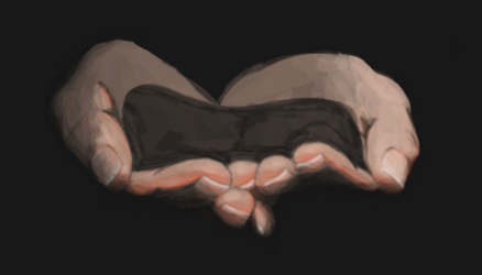
My rough idea starting out was to draw hands offering up the city at night and to have the hands and city lights coming out of the dark. I started my piece by drawing the hands without thinking too much about what I wanted to put in or around them. 

Once I was happy with the hands without really thinking about it too much I drew some of iconic buildings of London but also some of the ones that are less well known but I have a connection too, like the OXO tower that I associate with fire spinning on the full moon. 

I drew the buildings in a matter of minutes intending them to be a rough outline that I would then draw over. 

In the end I ended up liking the way it looked with the sketchy style buildings instead of rendering them in a similar style to the hands. The contrast between the styles and the loose lines give the city energy and life that I think would have been lost if I kept working on it too much more. 


At David's prompting I added some colour to it and this is the final version of the piece I drew:

Comment

Jurassic Park Lego

Comment

Jurassic Park Lego

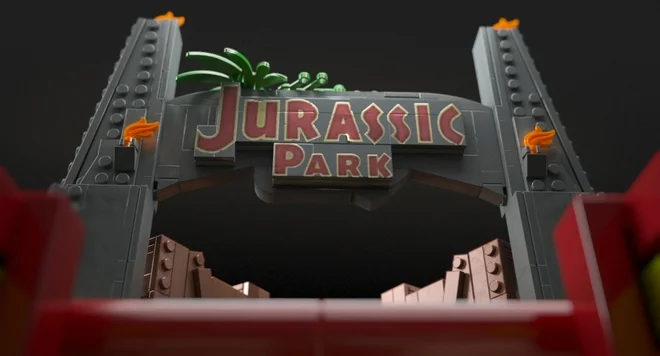
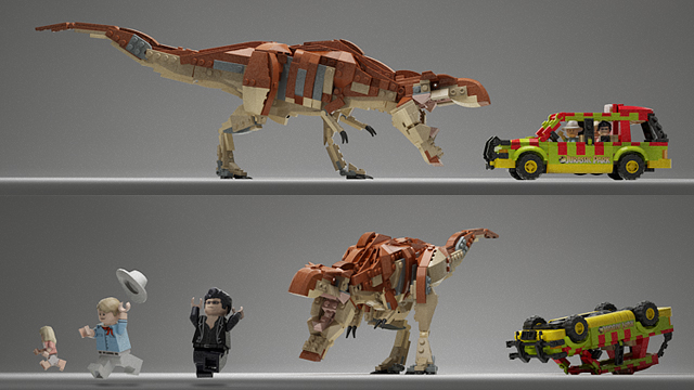
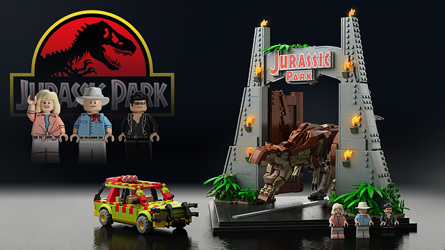
This Lego Jurassic Park set, quite apart from being both awesome design and atmospheric photography, is a custom design by Senteosan for Lego Ideas. The idea behind the site is that designers submit plans for Lego models and users vote on their favorites. Designs that receive over 10,000 votes go through a review process by Lego and chosen designs get released as official Lego products. Designers even get a slice of the profits. Previous approved Lego Ideas designs include a Ghostbusters Ecto1 and a Big Bang Theory set.
Unfortunately, despite this amazing Lego series having received over the requisite 10,000 votes, Lego has, to date, not approved the design. I think this is a real shame, as Senteosan's design is so much more creative and like the Lego of old than the official Jurassic World Lego. Senteosan's T-rex, made of multiple bricks and requiring assembly feels like a genuine Lego set, as opposed to the new, single piece plastic dinosaurs which lack the requirements for creativity and imagination that made Lego successful. Plenty has been written on how the prepacked Lego sets stifle creativity, so its a real shame that Lego hasn't taken the opportunity to give its customers what they are crying out for. Of course, its not too late. Maybe there's still time for them to learn their lesson.

The Jurassic Park Gate is a famous trademark of the Jurassic Park Series. It first appeared in the first movie 1993 when the tour cars entered the Park and it is definitely one of the most iconic scenes in motion picture history. Now recreated in Lego form too - ohh, with some extra spice...

I got this idea right before 3D version of first film hit theaters on April 2013. I used a tremendous amount of time drafting models again and again, making sure that all propositions are right and each component looking as realistic as possible. I have always thought this as a display piece, like UCS -style eye catcher but there certainly is a lot play value here too.
— https://ideas.lego.com/projects/83161 - Senteosan

Comment

Disney: The 90s Supercut

Comment

Disney: The 90s Supercut

I work as a professional trailer editor, this is simply an editing exercise I’ve done in my free time. Featuring Disney’s 2D animation films from The Great Mouse Detective (1986) to Treasure Planet (2002). I hope you enjoy.
— indrancole3

This supercut of 90s Disney animations is a walk down memory lane. All the classic animations from my childhood are represented here, in a great edit which captures the energy and excitement that I felt when watching them. Youtube's indrancole3 has done a great job editing this and, although its completely unofficial, I feel Disney would do well to promote it. It makes me want to go back and watch those movies again. Great work.

Comment

Star Wars: The Force Awakens Comic-Con 2015 Reel

Comment

Star Wars: The Force Awakens Comic-Con 2015 Reel

In a climate where people hate spoilers, and are so protective of not having their experience of something ruined by them, it always surprises me how desperate some people are to get information about a film before its released. And of all the movie franchise, the biggest victim of this desperate hunt for spoilers has to be the Star Wars movies. A quick google for Star Wars spoilers returns 15,500,000 results, showing how hungry people are for some nugget of information on the upcoming Force Awakens movie that will, ultimately, diminish the experience that they have upon seeing the final product.

At the same time, movie promoters are often criticized for ruining films by showing too much. From a business perspective, this does make sense - in a bid to secure audiences for $200 million movies, the studios often put out trailers which show most of the highlights of a film ina bid to drum up excitement. With budgets this large it is certainly necessary to build the excitement, and very often the technique works. But it can leave the experience of watching the whole film unsatisfying, as dramatic reveals and epic finales lose the surprise effect that the filmmaker had been building towards.

Which is why it is both surprising and very satisfying to see that the executives at Disney/Lucasfilm have decided to put out a Star Wars: Episode VII trailer at Comic-Con, which manages to build excitement while revealing nothing of the film itself. Instead, they have chosen to show glimpses of sets and costumes, intercut with interviews from the people who work on the film, discussing how excited they are to be a part of the project. I think I'm more excited by this trailer than I would have been by an epic trailer which gave away previously unknown information, and at the same time my experience of the film has not been diminished by this trailer. Indeed, if anything it has been enhanced as it shows the passion that has been poured into the film, which will be visible on the screen.

I think that this is a masterclass in film promotion, and one that other film promoters (I'm looking at you Terminator: Genisys) would do well to learn from.

Comment

The Photography Filters Cheat Sheet

Comment

The Photography Filters Cheat Sheet

Getting started in photography can be an overwhelming process. Learning about lenses and optics can be tricky enough, that the prospect of having to get to grips with filters as well can often be a step too far for beginner photographers. But filters can often be an essential tool in the professional photographer's kitbag, enhancing colour and helping to manage difficult lighting environments, and taking the time to experiment with filters can be hugely beneficial.

Luckily, photo gift company Zippi has published a handy infographic 'cheat sheet' introduction to filters, which should get you up and running with what filters to use when and why.

Filters are useful in a wide range of situations and proper use of them can add a valuable dimension to your photographer. The graphic below aims to demystify lens filters and give you a handy guide to when and where to use the appropriate ones. Whether you are interested in travel photography, sports photography or you like to try your hand at a range of disciplines you will find various filters mentioned below useful.
— zippi.co.uk

There's a higher resolution version of this infographic over at the Zippi website.

Comment

Formulaic Movie Marketing

Comment

Formulaic Movie Marketing

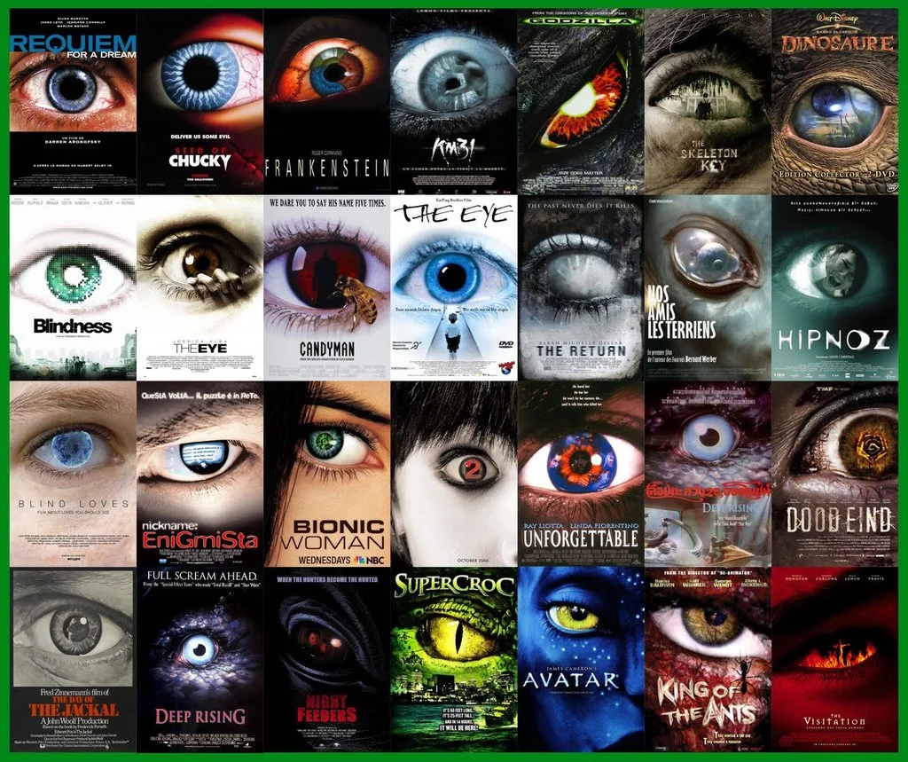
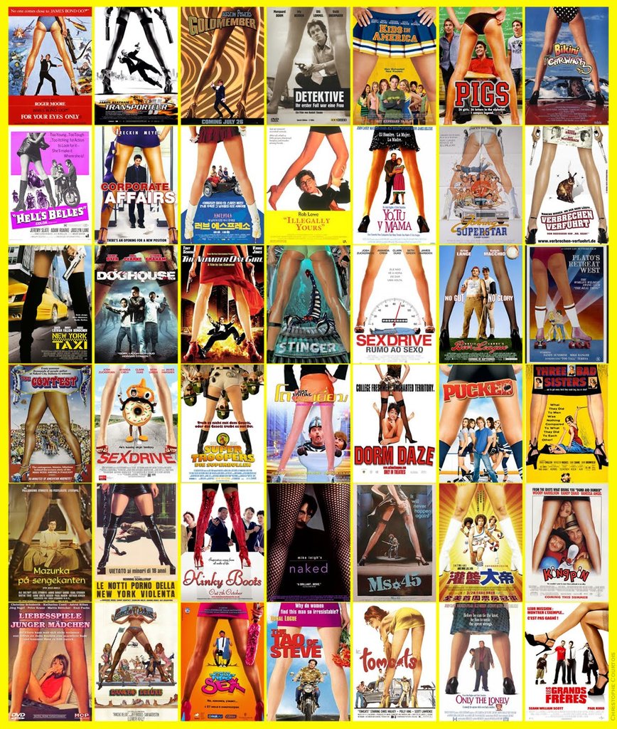
A lot has been said about how big movies are becoming formulaic and similar, but any similarities in the actual movies are as nothing when compared to the formulaic patterns we see in the marketing. Movie posters have been reduced to a series of patterns and formulas, a plug-and-play solution for all your genre film needs. Action movie? Show the moodily lit back of a hero, probably holding a weapon. Horror? Jump to the close up of a big eye. Sexy comedy? Time for the classic through the legs shot.

The formulaic nature of movie marketing extends to trailers as well, particularly action movies, which consistently use the same tropes - opening shot of a city, action montage, dramatic cut to silence, comedy beat before end, and of course, the ubiquitous BRAAAMs sound that we have been treated to ever since the Inception trailer hit our screens. (Side note, there is quite some debate over who is responsible for this iconic sound.)  This supercut of action movie trailers from Red Letter Media nicely sums up the way these tropes keep reappearing.

I understand why this happens. With shortening deadlines and increasing pressure, designers and editors are given less and less time create promotional material. Its understandable that they would reach for imagery and patterns which they know will work, rather than lose time experimenting on things their clients might not recognize. At the same time, ever increasing production budgets make the costs of a movie failing all the more disastrous, and this makes studio executives all the more cautious about deviating from proven marketing strategies. But what makes this all the more frustrating is that there is so much creativity being demonstrated in the fan-made movie posters which surface on the internet. The images below demonstrate some really imaginative and different approaches to marketing these movies, which capture the essence of the film and would have certainly stood out against the tide of more formulaic posters. I'm particularly taken with alex4everdn's Captain America poster, which would have piqued my interest had it been used in the marketing campaign for the film.


by xombiedirge

by xombiedirge

by alex4everdn

by alex4everdn

By Kirk Dunne

By Kirk Dunne

In conclusion, the reality is that this state of affairs is unlikely to change any time soon. As long as films marketed using these formulas continue to be successful, which seems to be the case, studios are not incentivised to change their strategies. I think the big loser in this is the consumer, for whom it is increasingly difficult to differentiate between the different films being released, and this is a shame.

As a final note, I'll finish with what I consider to be the most egregious example of movie marketing being standardized. Legendary designer and godfather of motion graphics Saul Bass designed some classic movie posters in the 50s and 60s, but when these films have been rereleased on DVD, the cover art has rejected Bass's iconic imagery in favor of much more generic cover art. Its a real shame.

LOVE IN THE AFTERNOON Original design by Saul Bass (1957)LOVE IN THE AFTERNOON DVD, Warner Home Video (2002)

LOVE IN THE AFTERNOON 
Original design by Saul Bass (1957)

LOVE IN THE AFTERNOON 
DVD, Warner Home Video (2002)

ANATOMY OF A MURDER Original design by Saul Bass (1959)ANATOMY OF A MURDER DVD, Sony Pictures (2000)

ANATOMY OF A MURDER 
Original design by Saul Bass (1959)

ANATOMY OF A MURDER 
DVD, Sony Pictures (2000)

Comment

Mad Max and The Doof Warrior

Comment

Mad Max and The Doof Warrior

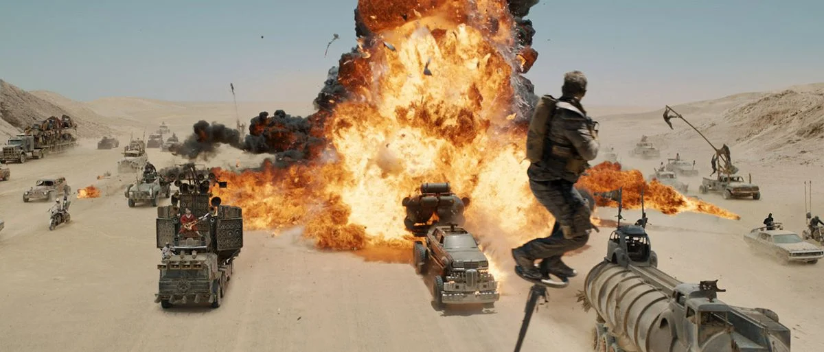
The internet has been abuzz since it's been released, even outside of VFX circles, about the use of practical effects in Mad Max (one of my favourite films this year by a clear mile). With some nice before and after shots being released it’s great to see breakdowns of the Special as well as Visual effects that went into making it. 

The element I was most pleased to find out had actually been created was hands down the guitar used by The Doof Warrior (Otherwise known as ‘holy shit that guy has a flamethrower’) played by musician-actor iOTA. Director George Miller explained in an interview with The Daily BeastPre-modern communications, there was always the music of war — the bugle, horns, bagpipes, drummers. Every war culture had some sound to signal the troops… ours is just weaponized, so it’s a flamethrower as well.”

...it was gas and it was controlled by the whammy bar…
— http://noisey.vice.com/blog/we-talked-to-the-dude-who-plays-a-flame-throwing-guitar-in-mad-max-fury-road

The Doof Warrior has become a focal part of some reviews and the film for many fans despite having less than a minute of screen time. Given this it was only a matter of time before a DIY ukulele version came out...Right??

Fan Caleb Kraft has been channeling his inner Doof and put together a video tutorial on how to make your own hellfire flinging hipster guitar on Youtube.

I didn’t want to try to replicate exactly what he had, and I also wanted to scale things down to be marginally safer.
— http://makezine.com/projects/mad-max-doof-warrior-inspired-flamethrower-ukulele/

Kraft's video doesn't show the final product being played, although I feel the sound might not be the point.

Comment

PJMC Quade & The Mighty Quint

Comment

PJMC Quade & The Mighty Quint

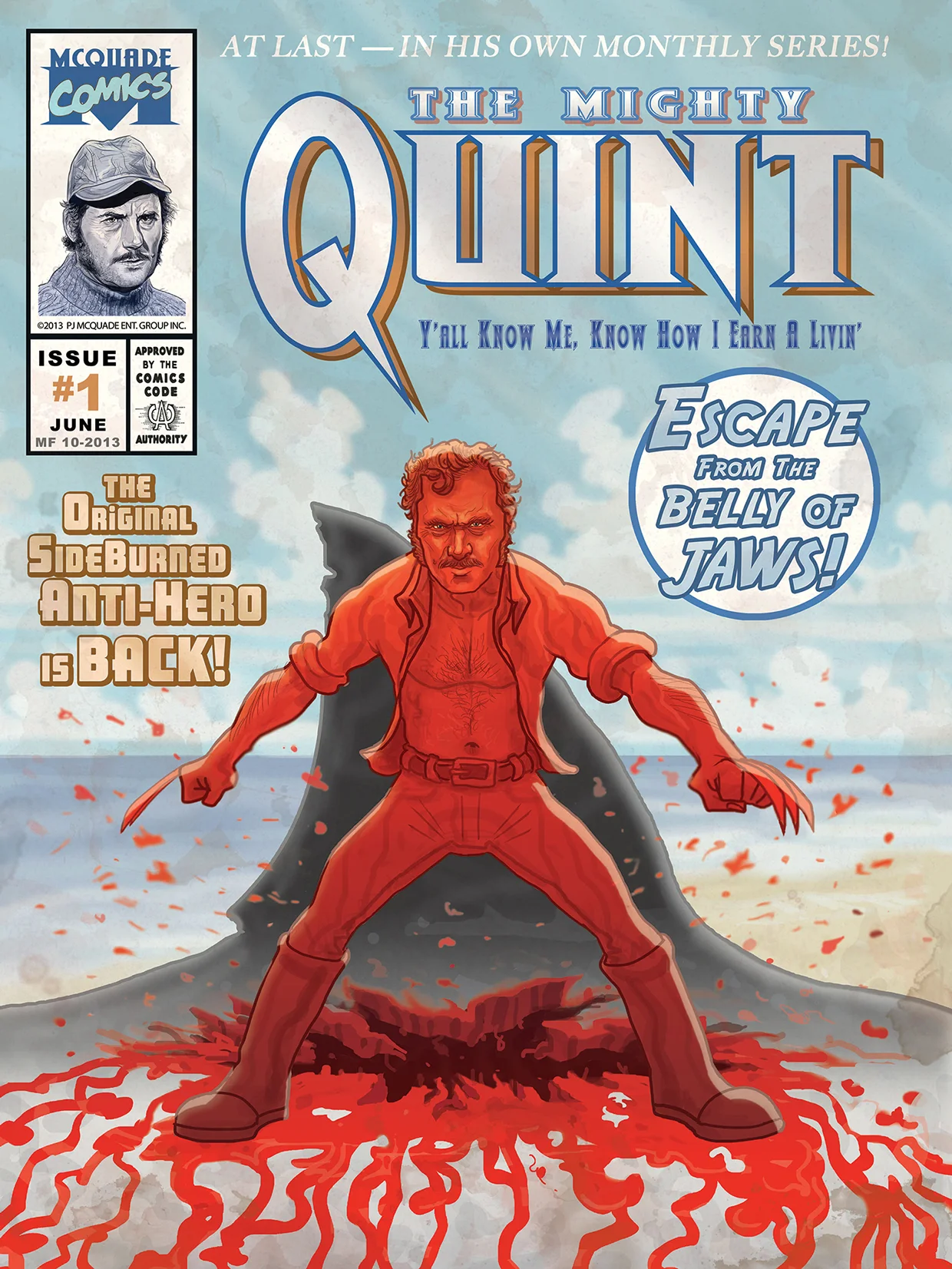
Brooklyn-based illustrator PJMC Quade has a catalog of geeky, pop-icon inspired art. The portfolio work on his website is primarily fan art and mashups of some classic pop-culture iconography, as well as some more obscure choices. Some of my favourites include True Romance and The Venture Bros. (pictured below). But my absolute favourite is the mashup of Quint from Jaws with Wolverine, and it seems appropriate at the 40th Anniversary of the great shark movie to give this picture some prominence.

Inspired by the similarity between Quint's sideburns and those of Wolverine, Quade pictures an adamantium clawed Quint, bursting from the stomach of the shark which eats him at the end of the the movie. In a homage to Wolverine, the artwork is designed as the cover of issue #1 of a Quint comic, which looks thrilling.

Whenever I watch Jaws I am always struck by how dope Quint’s sideburns are. He really rocks the stuffing out of them. Always made me think of another famous fictional fella with killer burns - Wolverine! So I thought what if Quint was actually a mutant, had a healing factor and an adamantium skeleton with killer claws. He’d slash his way out Jaw’s belly, emerged from the blood reborn, ready to take the high seas by storm. I designed it as a comic book cover, an homage to Wolverine #1. At last - in his own monthly series!
— PJMC Quade

Comment

Scanning the President in 3D

Comment

Scanning the President in 3D

This isn’t an artistic likeness of the president ... This is actually millions upon millions of measurements that create a 3D likeness that we can now 3D print — and make something that’s never been done before.
— Adam Metallo - http://www.siggraph.org/discover/news/president-obama-lands-first-3d-presidential-portrait
This President Abraham Lincoln plaster cast from April 1860 was the inspiration for the digital face scan

This President Abraham Lincoln plaster cast from April 1860 was the inspiration for the digital face scan

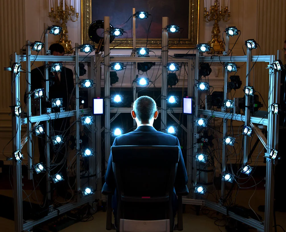
This news passed me by when it came out in December 2014, but its a remarkable testament to how far the development of digital humans has come. Barack Obama became the first US President to have his likeness digitally scanned and 3D-printed. Inspired by the plaster casts of President Lincoln, Adam Metallo and Vincent Rossi conceived of the project to digitally represent Obama, which was lead by Günter Waibel, Director of the Smithsonian 3D Digitization Program Office.

The process used a mobile version of Paul Debevec's Lightstage technology, which uses an array of 50 lights and 8 DSLRs to capture 80 photographs in a range of lighting in under 1 second. This quickly capture vast detail and lighting information from a subject's face. Lightstage has been used to create digital faces for a number of Hollywood films including The Curious Case of Benjamin Button and Avatar, and Debevec and his team won a Scientific and Engineering Award (a scientific Oscar) for the Lightstage.

The Lightstage data was augmented with data from hand-held digital scanners, which were able to fill in the missing data from the back of the President's head. The entire process of digital capture took just 7 minutes, which is even more impressive when you consider that it took 15 minutes for the plaster to dry on Lincon's face. Of course, the real work started once they left the White House. The different data sets needed to be combined into a unified space and then optimized into a 15 million polygon model ready for 3D printing.

The files were then transferred to 3D Systems, who used a process called Selective Laser Sintering to print a highly detailed 1:1 scale bust of President Obama over 42 hours. The bust is now on display in the Smithsonian museum in Washington.

Paul Debevec explains how the Lighstage works:

Comment

Jaws in 3 Minutes

Comment

Jaws in 3 Minutes

In honor of the 40th Anniversary of Steven Spielberg's genre defining shark movie Jaws, editor Robert Jones has cut the 124 minute feature down to a concise 3 minutes, that way you can relieve the thrills and terror of everyone's favorite shark hunt quickly and easily.

Jones has done an excellent job of this, the tension is built expertly and the first two acts of the movie are stripped down to their bear essentials, conveying everything the audience needs to know and leaving plenty of time (relatively speaking) to dwell on the film's last act. It's a testimony to what can be done with editing. Excellent work and a great tribute to a much beloved film. 

Comment

Federico Babina - Archidirector

Comment

Federico Babina - Archidirector

The architecture is like a scene from a movie where the story is the life, the script is dictated by the use of the building and where the actors are the residents. A labyrinth where all - characters, director, audience –are lost and found in the intensity of their emotions.
— Federico Babina

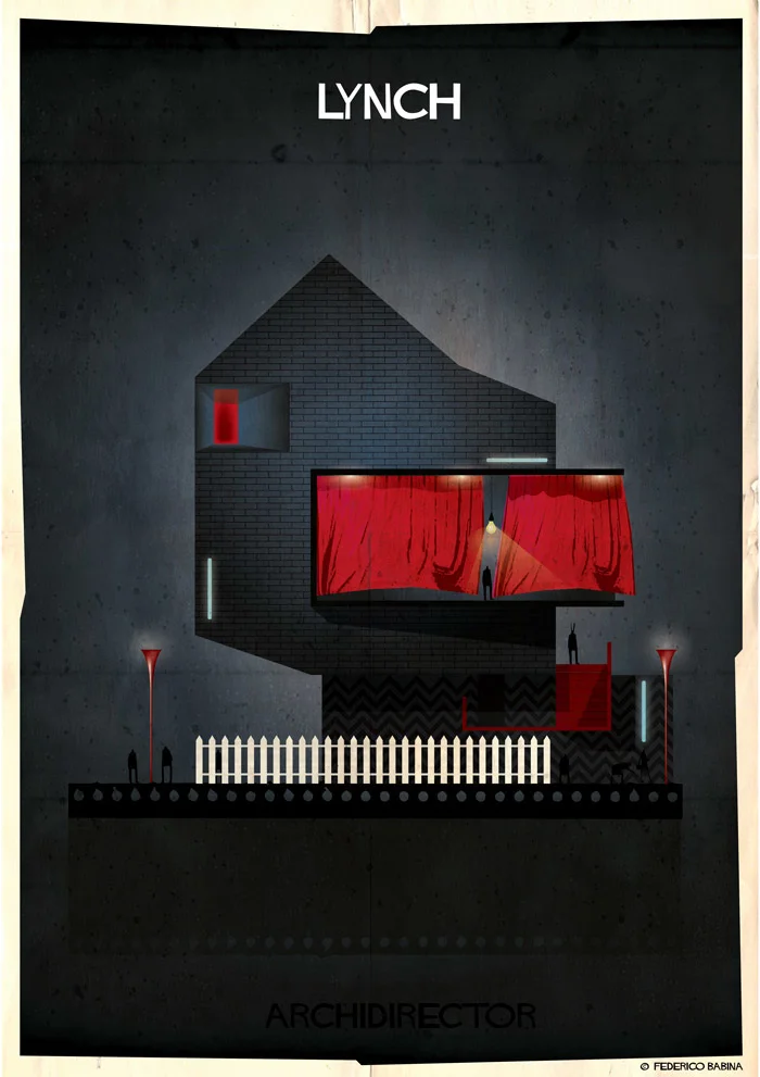
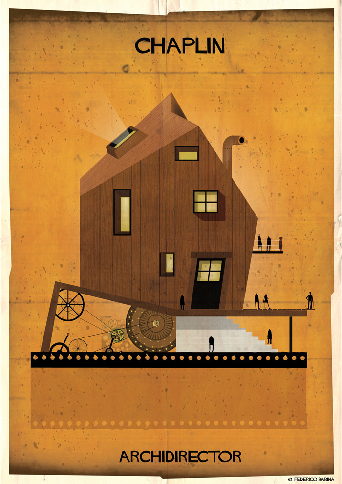
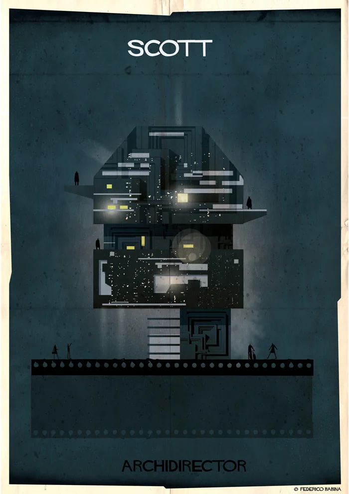
Barcelona-based illustrator and architect Federico Babina has released a series of illustrations in which he represents different Hollywood directors as buildings. I find them interesting for a number of reasons, but the primary one is in how Babina has captured the style of each director, while maintaining a consistent look across all of the images.

While each of the illustrations represents the work of the relevant director, personally I find the most successful ones to be those which the auteur style of the entire body of work has been condensed into a single image, such as those of Tim Burton or Fritz Lang, which are recognizably representations of the director, but not of a specific film. In contrast, the Ridley Scott and Stanley Kubrick images are more representations of specific films (Blade Runner and 2001: A Space Odyssey respectively) than they are of the director's entire oeuvre, and as a result are less successful. That said, all of the illustrations in Babina's Archidirector series are very charming and look great. And they put me in mind somewhat of old movie posters, particularly those of Saul Bass, which is a great club to be in.

View the entire Archidirector series here.

Comment

Making of Rise of the Tomb Raider

Comment

Making of Rise of the Tomb Raider

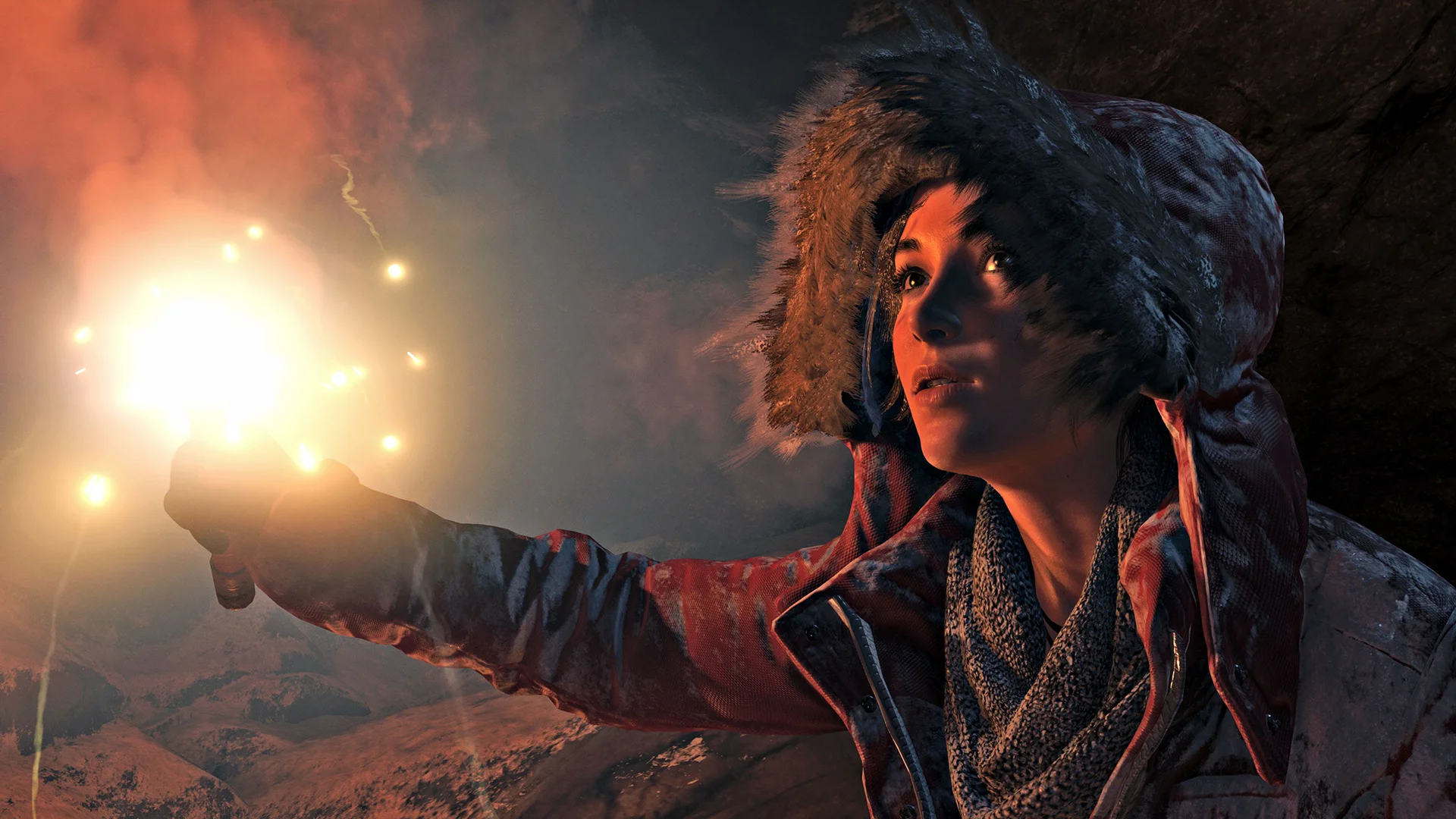
Rise of the Tomb Raider, sequel to the 2013 Tomb Raider reboot, was announced at the E3 Expo last year, to some confusion and no small amount of controversy, as an Xbox One exclusive, at least initially. But I'm much more interested in the PC release, expected some time in 2016, for which I'm hoping that developers Crystal Dynamics will up the already beautiful looking graphics. In this video from E3 2015, Art Director Brenoch Adams and Lead Character Artist Kam Yu discuss how they brought Lara Croft to the screen, and frankly the results are stunning. This is one of the best real-time human characters that I have ever seen, and the level of detail they have delivered in striking. I particularly appreciate that the scars Lara acquired in the previous game have been carried over to the new model.
Of course, all we have seen so far are promos and tech demos. The real test will be how well does that asset hold up in actual game play. But things are looking good so far, and I have high hopes for what we will see come the Xbox release in December.

Comment