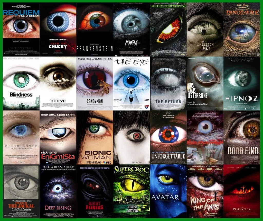
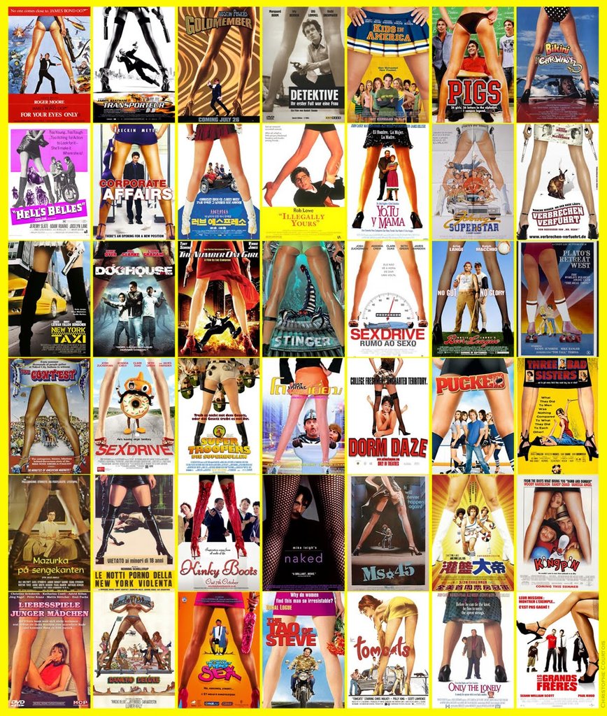
A lot has been said about how big movies are becoming formulaic and similar, but any similarities in the actual movies are as nothing when compared to the formulaic patterns we see in the marketing. Movie posters have been reduced to a series of patterns and formulas, a plug-and-play solution for all your genre film needs. Action movie? Show the moodily lit back of a hero, probably holding a weapon. Horror? Jump to the close up of a big eye. Sexy comedy? Time for the classic through the legs shot.
The formulaic nature of movie marketing extends to trailers as well, particularly action movies, which consistently use the same tropes - opening shot of a city, action montage, dramatic cut to silence, comedy beat before end, and of course, the ubiquitous BRAAAMs sound that we have been treated to ever since the Inception trailer hit our screens. (Side note, there is quite some debate over who is responsible for this iconic sound.) This supercut of action movie trailers from Red Letter Media nicely sums up the way these tropes keep reappearing.
I understand why this happens. With shortening deadlines and increasing pressure, designers and editors are given less and less time create promotional material. Its understandable that they would reach for imagery and patterns which they know will work, rather than lose time experimenting on things their clients might not recognize. At the same time, ever increasing production budgets make the costs of a movie failing all the more disastrous, and this makes studio executives all the more cautious about deviating from proven marketing strategies. But what makes this all the more frustrating is that there is so much creativity being demonstrated in the fan-made movie posters which surface on the internet. The images below demonstrate some really imaginative and different approaches to marketing these movies, which capture the essence of the film and would have certainly stood out against the tide of more formulaic posters. I'm particularly taken with alex4everdn's Captain America poster, which would have piqued my interest had it been used in the marketing campaign for the film.
In conclusion, the reality is that this state of affairs is unlikely to change any time soon. As long as films marketed using these formulas continue to be successful, which seems to be the case, studios are not incentivised to change their strategies. I think the big loser in this is the consumer, for whom it is increasingly difficult to differentiate between the different films being released, and this is a shame.
As a final note, I'll finish with what I consider to be the most egregious example of movie marketing being standardized. Legendary designer and godfather of motion graphics Saul Bass designed some classic movie posters in the 50s and 60s, but when these films have been rereleased on DVD, the cover art has rejected Bass's iconic imagery in favor of much more generic cover art. Its a real shame.
LOVE IN THE AFTERNOON
Original design by Saul Bass (1957)
LOVE IN THE AFTERNOON
DVD, Warner Home Video (2002)
ANATOMY OF A MURDER
Original design by Saul Bass (1959)
ANATOMY OF A MURDER
DVD, Sony Pictures (2000)


