Viewing entries in
Movies

2001: A Picasso Odyssey

Comment

2001: A Picasso Odyssey

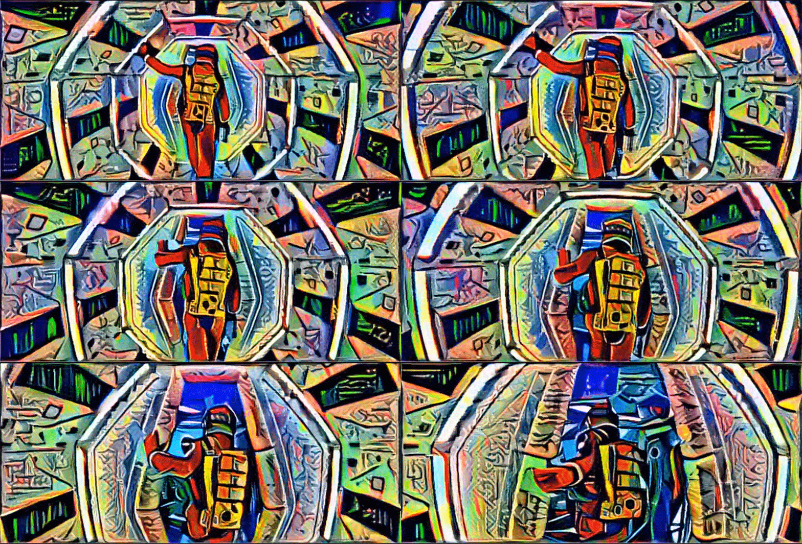
Artist Bhautik Joshi has been running footage through Deep Dream, Google's trippy image making software, transforming the film into a vivid cubist spectacle. The images are generated using Deep Dream's deep learning algorithms, which can analyse image data and apply the style of one image to that of another. It is the technique that is at the heart of Google's image recognition tools, and their project to teach computers to analyse images and distinguish their content. But it also offers artists unique opportunities to create fascinating projects that fuse art and technology in surprising ways and generate compelling imagery that would be difficult to make using conventional means.

The footage that Joshi has chosen, from Stanely Kubrick's 2001: A Space Odyssey, is a perfect choice for this kind of treatment. 2001 is a film with a very clean visual design and bold, striking, and very recognizable images. Looking at Joshi's clip, you immediately know what the source material is. But the film is the story, at least in part, of humankind's relationship with technology, and to see it presented this way - at the cutting edge of where technology meets artistic expression - adds another layer of complexity to the subject material.

Joshi has also created a somewhat creepy video by feeding footage of Donald Trump's face into Deep Dream and fusing it with images of food, bullets and even teeth. Its a little disturbing, but it by showing the before and after footage the clip below helps to explain how the Deep Dream technology works.

madmax_3370396k.jpg

Joshi isn't the only person using Deep Dream to making fascinating images. A number of artists have been feeding strange combinations of pictures into the software and generating some weird and compelling imagery. But he is the first person that I have seen creating images with such strong visual cohesion, and also the first I have seen to create video.

I'm fascinated by this, both the technology and its creative potential. I look forward to seeing what will come from it.
Comment

Mark Bakowski talks Spectre

Comment

Mark Bakowski talks Spectre

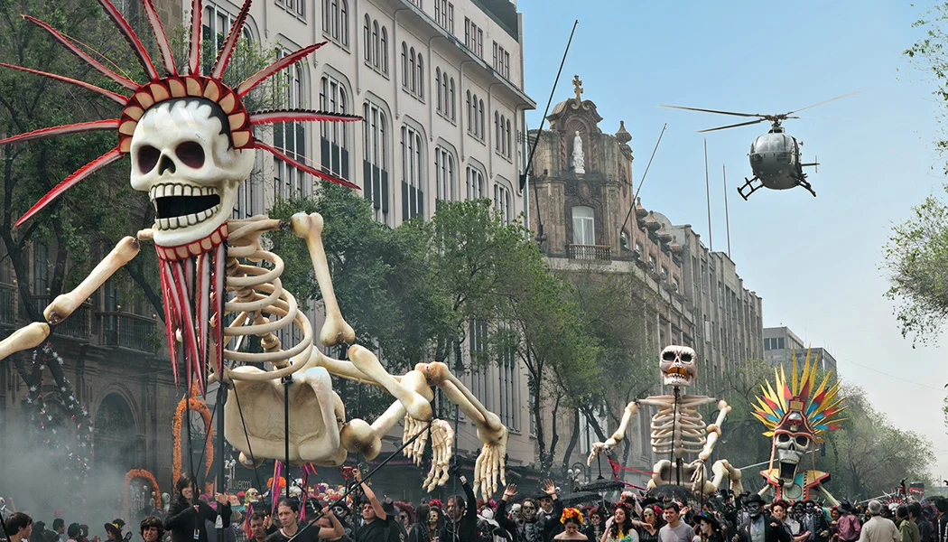
An incredible amount of visual effects work went into the opening shot which comprised of 6 different plates shot in both Mexico City and at Pinewood Studios and totaled around 6’000 frames. The shot work included large crowd simulations, digital matte environment extensions, prop additions, rig removal and cleanup and digi-doubles.
— Mark Bakowski, interview with Art of VFX

Mark Bakowski, VFX supervisor at ILM London talks to Art of VFX about the work done on the new James Bond epic Spectre. Mark talks in great detail about the often invisible VFX work done by the ILM team, particularly on the spectactular Day of the Dead sequence in Mexico, which has been getting a lot of attention in reviews of the film. He also explains how the 5 minute opening shot was stitched together from 6 different plates, and augmented with lots of digital effects work to create the compelling start to the movie. 

The Mexico City environment was a fully digital asset created by the Generalist department at ILM London.
— Mark Bakowski, interview with Art of VFX

I had the privilege of working as a compositor at ILM London on Spectre for around 8 months, working under Mark's supervision. Indeed this is the fourth project on which I have worked for Mark Bakowski, but Spectre was a particularly interesting project to work on. The compositing team was fairly small, and we had a large number of very complex shots to deliver, so it was a fast paced and challenging show. But Mark, and compositing supervisor Dan Snape, made for a great supervision team, ensuring that the work we delivered was consistently of a high standard. As a junior compositor, it was a great experience to be working on this project and I learned a great deal and developed a lot as an artist. Plus I got to composite some great looking shots, and work on a film which has been very warmly received, which is always a plus.

Never underestimate a retime! But you live and learn….
— Mark Bakowski, interview with Art of VFX

Comment

Star Wars Sky Movies Promo

Comment

Star Wars Sky Movies Promo

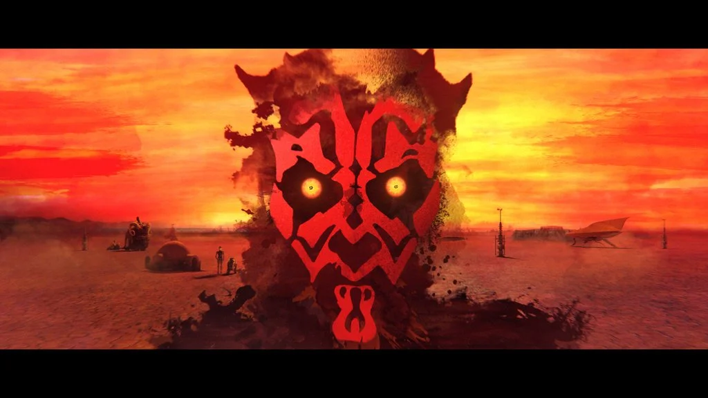
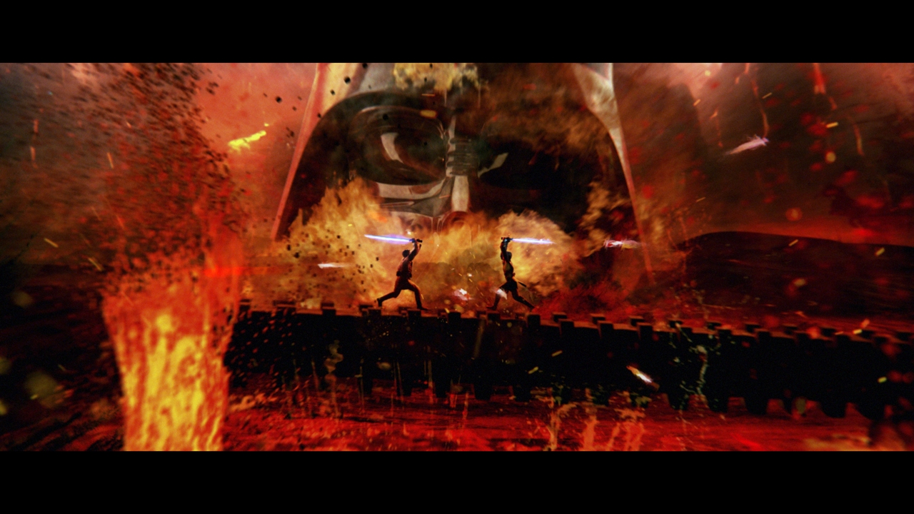
In order to get you ready for Star Wars Episode VII, Sky Movies is screening all six Star Wars movies, which you can watch back-to-back. To promote this, MPC Advertising have produced a stunning 30 second promo, which takes viewers on a whistle-stop tour through a the complete saga. With a combination of footage from the movies, and animated stills, the promo is a series of vignettes which represent each of the Star Wars Episodes, each of which is rich in detail. But for me it is the transitions between these moments which are the most compelling, and make the promo hold up for repeat viewings.

Directed by Steven Hoare, with Lee Parker as Creative Director and VFX from MPC, this promo is well worth a watch

Comment

Formulaic Movie Marketing

Comment

Formulaic Movie Marketing

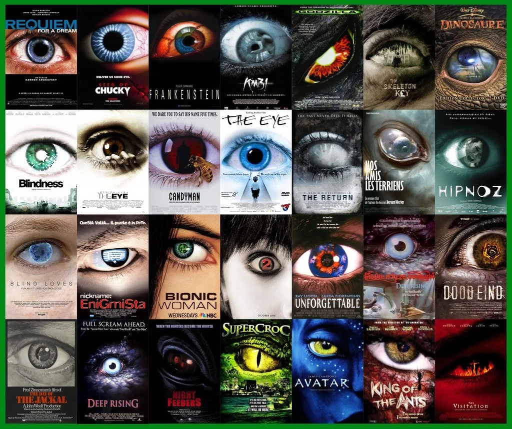
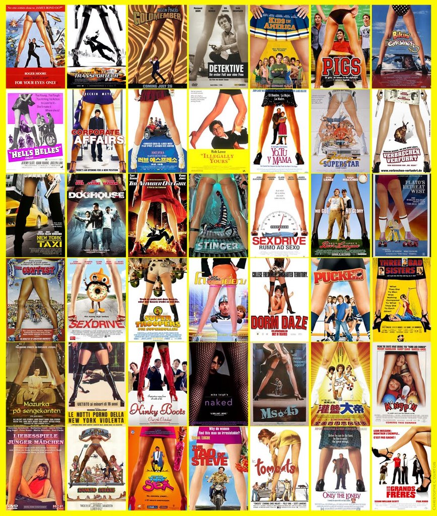
A lot has been said about how big movies are becoming formulaic and similar, but any similarities in the actual movies are as nothing when compared to the formulaic patterns we see in the marketing. Movie posters have been reduced to a series of patterns and formulas, a plug-and-play solution for all your genre film needs. Action movie? Show the moodily lit back of a hero, probably holding a weapon. Horror? Jump to the close up of a big eye. Sexy comedy? Time for the classic through the legs shot.

The formulaic nature of movie marketing extends to trailers as well, particularly action movies, which consistently use the same tropes - opening shot of a city, action montage, dramatic cut to silence, comedy beat before end, and of course, the ubiquitous BRAAAMs sound that we have been treated to ever since the Inception trailer hit our screens. (Side note, there is quite some debate over who is responsible for this iconic sound.)  This supercut of action movie trailers from Red Letter Media nicely sums up the way these tropes keep reappearing.

I understand why this happens. With shortening deadlines and increasing pressure, designers and editors are given less and less time create promotional material. Its understandable that they would reach for imagery and patterns which they know will work, rather than lose time experimenting on things their clients might not recognize. At the same time, ever increasing production budgets make the costs of a movie failing all the more disastrous, and this makes studio executives all the more cautious about deviating from proven marketing strategies. But what makes this all the more frustrating is that there is so much creativity being demonstrated in the fan-made movie posters which surface on the internet. The images below demonstrate some really imaginative and different approaches to marketing these movies, which capture the essence of the film and would have certainly stood out against the tide of more formulaic posters. I'm particularly taken with alex4everdn's Captain America poster, which would have piqued my interest had it been used in the marketing campaign for the film.


by xombiedirge

by xombiedirge

by alex4everdn

by alex4everdn

By Kirk Dunne

By Kirk Dunne

In conclusion, the reality is that this state of affairs is unlikely to change any time soon. As long as films marketed using these formulas continue to be successful, which seems to be the case, studios are not incentivised to change their strategies. I think the big loser in this is the consumer, for whom it is increasingly difficult to differentiate between the different films being released, and this is a shame.

As a final note, I'll finish with what I consider to be the most egregious example of movie marketing being standardized. Legendary designer and godfather of motion graphics Saul Bass designed some classic movie posters in the 50s and 60s, but when these films have been rereleased on DVD, the cover art has rejected Bass's iconic imagery in favor of much more generic cover art. Its a real shame.

LOVE IN THE AFTERNOON Original design by Saul Bass (1957)LOVE IN THE AFTERNOON DVD, Warner Home Video (2002)

LOVE IN THE AFTERNOON 
Original design by Saul Bass (1957)

LOVE IN THE AFTERNOON 
DVD, Warner Home Video (2002)

ANATOMY OF A MURDER Original design by Saul Bass (1959)ANATOMY OF A MURDER DVD, Sony Pictures (2000)

ANATOMY OF A MURDER 
Original design by Saul Bass (1959)

ANATOMY OF A MURDER 
DVD, Sony Pictures (2000)

Comment

Mad Max and The Doof Warrior

Comment

Mad Max and The Doof Warrior

The internet has been abuzz since it's been released, even outside of VFX circles, about the use of practical effects in Mad Max (one of my favourite films this year by a clear mile). With some nice before and after shots being released it’s great to see breakdowns of the Special as well as Visual effects that went into making it. 

The element I was most pleased to find out had actually been created was hands down the guitar used by The Doof Warrior (Otherwise known as ‘holy shit that guy has a flamethrower’) played by musician-actor iOTA. Director George Miller explained in an interview with The Daily BeastPre-modern communications, there was always the music of war — the bugle, horns, bagpipes, drummers. Every war culture had some sound to signal the troops… ours is just weaponized, so it’s a flamethrower as well.”

...it was gas and it was controlled by the whammy bar…
— http://noisey.vice.com/blog/we-talked-to-the-dude-who-plays-a-flame-throwing-guitar-in-mad-max-fury-road

The Doof Warrior has become a focal part of some reviews and the film for many fans despite having less than a minute of screen time. Given this it was only a matter of time before a DIY ukulele version came out...Right??

Fan Caleb Kraft has been channeling his inner Doof and put together a video tutorial on how to make your own hellfire flinging hipster guitar on Youtube.

I didn’t want to try to replicate exactly what he had, and I also wanted to scale things down to be marginally safer.
— http://makezine.com/projects/mad-max-doof-warrior-inspired-flamethrower-ukulele/

Kraft's video doesn't show the final product being played, although I feel the sound might not be the point.

Comment

Jurassic World at Waterloo

Comment

Jurassic World at Waterloo

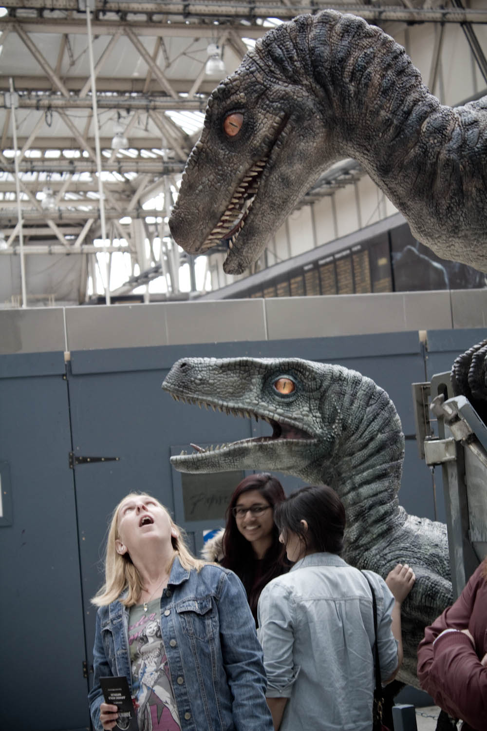
To celebrate the release of Jurassic World, velociraptors have been set loose in London's Waterloo station. Four life-sized and wonderfully detailed raptors have been built and placed in the station, complete with their own InGen transport crate, for tourists and commuters to admire and take photographs with. The models look a bit plastic-y when you get up close, but are otherwise incredibly life-like ... I assume. They certainly look believable.

The 4 velociraptors are part of Universal Pictures' 2 week 'Jurassic World  Takeover' event.

Jurassic World is taking over Waterloo Station! A two week, fully immersive, takeover of one of London’s busiest stations with 350k footfall per day. All branding, posters sites and digital screens will be themed to the film while the station will also be split into zones for ‘in-world’ and film advertising. The underground tunnel has been completely wrapped featuring Mosasaurus aquarium and Jungle raptor scenes while the mezzanine level will take you through a 10 minute audio tour available at www.jurassic.london
— press release quoted http://www.filmoria.co.uk/2015/06/jurassic-world-is-taking-over-waterloo/

This is the second dinosaur stunt to happen in London in recent weeks, following the National Geographic Channel driving a flatbed truck carrying a dead T-rex on the back, to promote it's T-rex Autopsy show.

Comment