Viewing entries in
animation

The Dream of Ink: UNHIDE Conference

Comment

The Dream of Ink: UNHIDE Conference

‘The Dream of Ink’ is a beautiful animated short, put together by the amazing Lightfarm Studios for the opening of the UNHIDE Conference, the first event focused on Digital Art in Brazil. Directed and Produced by Rafael Vallaperde, the short is the journey of a little girl made of ink through a phantasmagorical inky world.

I love the art style of this piece, and the way the use of colour, the character design, and the beautiful fluid simulations all support the aesthetic and the story being told.

Also, check out the video below for a short behind-the-scenes look at what went into making this film.

UNHIDE Conference took place in the city of São Paulo, Brazil, 2nd-4th November 2018. It was hosted by the UNHIDE school of digital art.

Comment

2001: A Picasso Odyssey

Comment

2001: A Picasso Odyssey

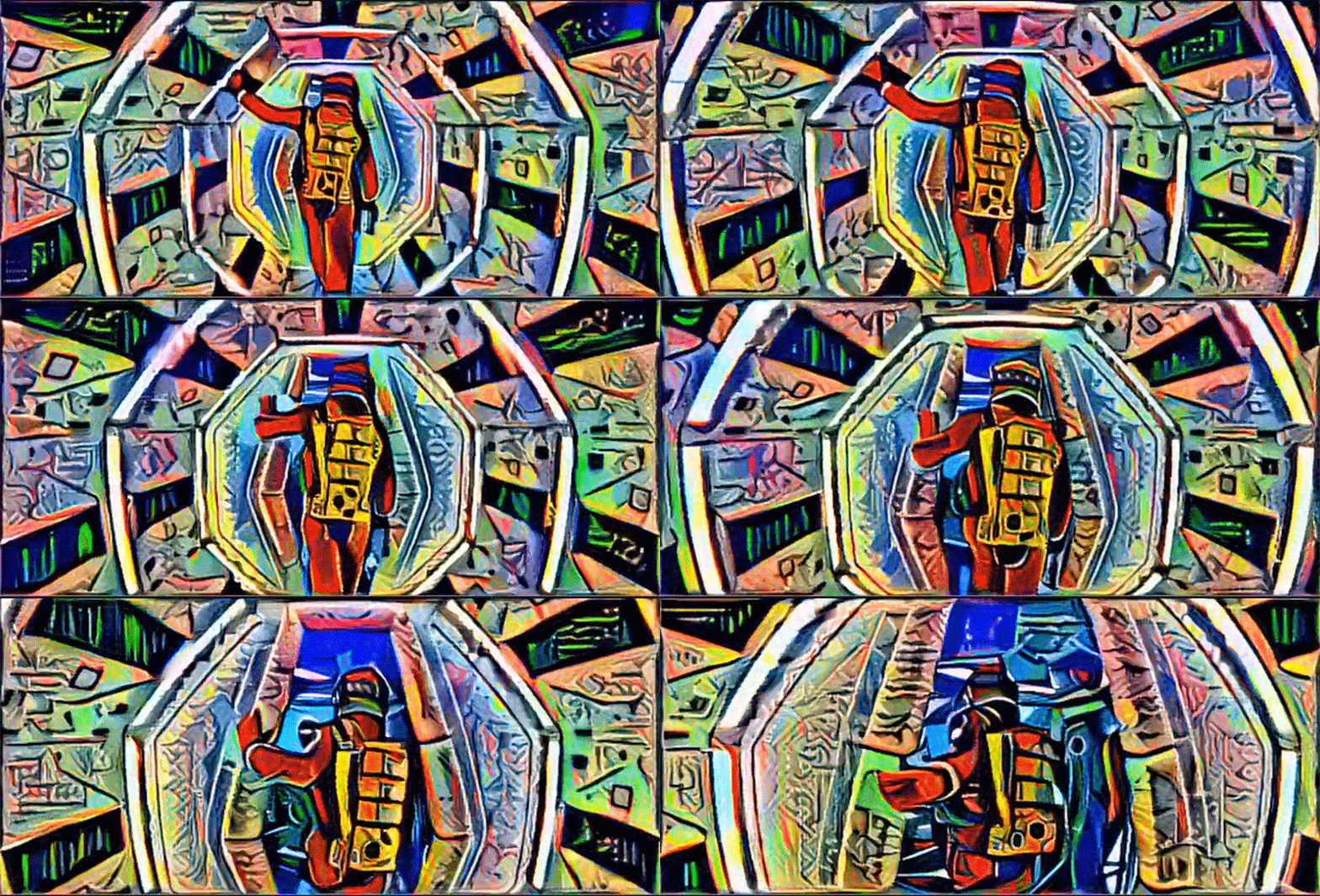
Artist Bhautik Joshi has been running footage through Deep Dream, Google's trippy image making software, transforming the film into a vivid cubist spectacle. The images are generated using Deep Dream's deep learning algorithms, which can analyse image data and apply the style of one image to that of another. It is the technique that is at the heart of Google's image recognition tools, and their project to teach computers to analyse images and distinguish their content. But it also offers artists unique opportunities to create fascinating projects that fuse art and technology in surprising ways and generate compelling imagery that would be difficult to make using conventional means.

The footage that Joshi has chosen, from Stanely Kubrick's 2001: A Space Odyssey, is a perfect choice for this kind of treatment. 2001 is a film with a very clean visual design and bold, striking, and very recognizable images. Looking at Joshi's clip, you immediately know what the source material is. But the film is the story, at least in part, of humankind's relationship with technology, and to see it presented this way - at the cutting edge of where technology meets artistic expression - adds another layer of complexity to the subject material.

Joshi has also created a somewhat creepy video by feeding footage of Donald Trump's face into Deep Dream and fusing it with images of food, bullets and even teeth. Its a little disturbing, but it by showing the before and after footage the clip below helps to explain how the Deep Dream technology works.

madmax_3370396k.jpg

Joshi isn't the only person using Deep Dream to making fascinating images. A number of artists have been feeding strange combinations of pictures into the software and generating some weird and compelling imagery. But he is the first person that I have seen creating images with such strong visual cohesion, and also the first I have seen to create video.

I'm fascinated by this, both the technology and its creative potential. I look forward to seeing what will come from it.

Comment

Method Design - AICP Sponsor Reel 2016

Comment

Method Design - AICP Sponsor Reel 2016

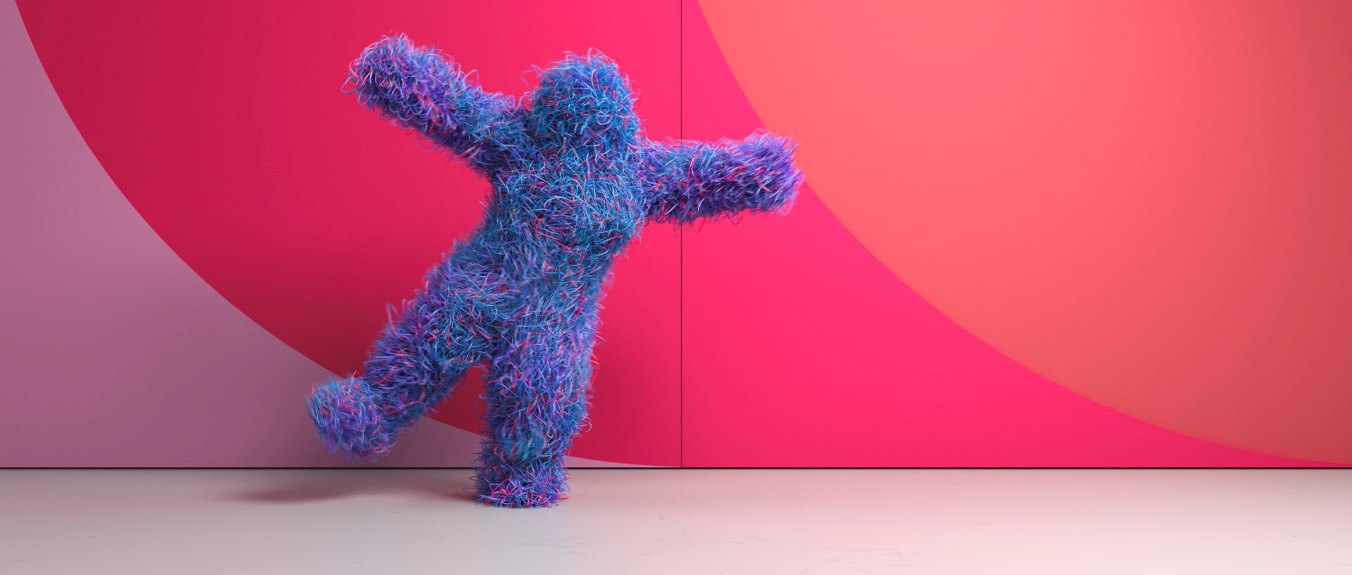
This VFX dance spectacular from Method Design must have been a dream job for the Houdini effects artists. Method was hired by production company RSA to produce this years AICP sponsor reel. Using motion-capture driven animation and dynamic simulations, the short playfully represents the AICP sponsors as dancing avatars.

I love this video. It's visually engaging and has a huge amount of energy, and the simulations are really creative. I'd love to have worked on this project. Congratulations to everyone that did.

Comment

Star Wars Sky Movies Promo

Comment

Star Wars Sky Movies Promo

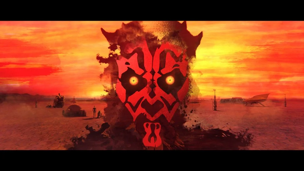
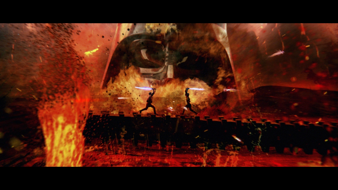
In order to get you ready for Star Wars Episode VII, Sky Movies is screening all six Star Wars movies, which you can watch back-to-back. To promote this, MPC Advertising have produced a stunning 30 second promo, which takes viewers on a whistle-stop tour through a the complete saga. With a combination of footage from the movies, and animated stills, the promo is a series of vignettes which represent each of the Star Wars Episodes, each of which is rich in detail. But for me it is the transitions between these moments which are the most compelling, and make the promo hold up for repeat viewings.

Directed by Steven Hoare, with Lee Parker as Creative Director and VFX from MPC, this promo is well worth a watch

Comment

LEGO Jurassic World - “A Jarring Encounter"

Comment

LEGO Jurassic World - “A Jarring Encounter"

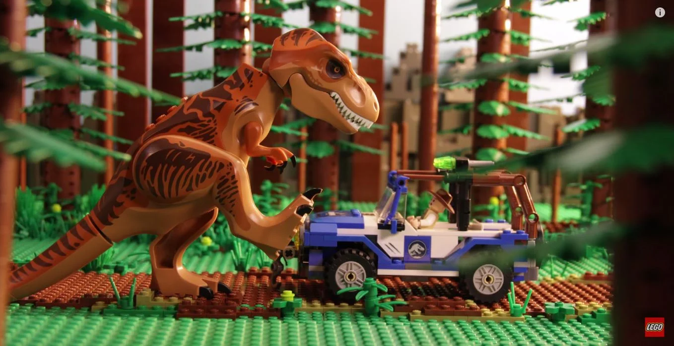
In honor of the release of Jurassic World or, more specifically, the Jurassic World Lego sets, Lego has put out this cute stop motion animation A Jarring Encounter. Directed by Kris Theorin of Something's Awry, this short captures everything that is charming and iconic about Lego stop motion animations - quirky, slapstick comedy with unexpected punchlines in a recognizably Lego environment. This is what Lego animation should be.

In contrast Lego has also put out Jurassic Pals, a fully CG animation featuring Lego characters in a photo real environment, by CC Pixels. The short is well animated, and beautifully lit and rendered, and I take no issue with it technically. But if The Lego Movie taught us anything, its that the charm of Lego CG animation is that it obeys the rules of Lego physics. Lego is made of solid plastic which doesn't bend, it just rotates at the joints. It is also distinctively adorned with lots of small plastic studs, which allows for the interlocking of pieces and into which the character's feet snap. These facts about Lego are clearly visible in A Jarring Encounter, and The Lego Movie captured them so perfectly that people questioned if it was really CG. Without these elements, the Lego design of the characters is purely an aesthetic choice, and almost incidental to overall film.

So, in conclusion, the rule-breaking nature of the CG animation ends up falling a little flat, but the stop motion A Jarring Encounter is funny and charming, everything a Lego animation should be.

Comment

Star Wars Battlefront

Comment

Star Wars Battlefront

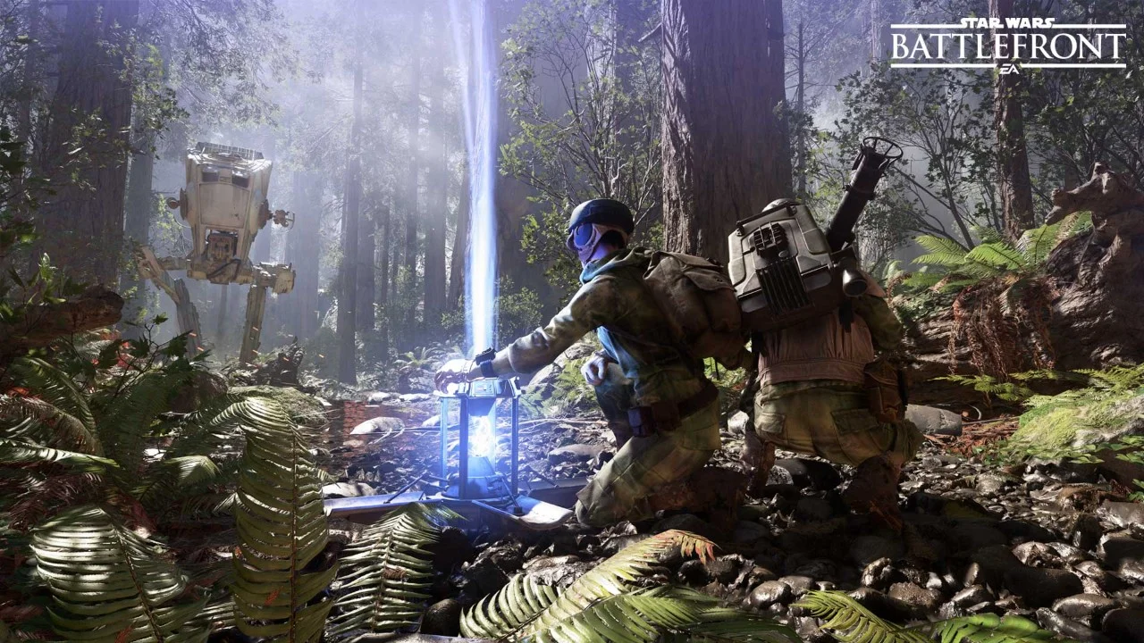
Electronic Arts has debuted the first 5 minutes of actual gameplay footage from their upcoming Star Wars: Battlefront at the E3 video game expo this week, and frankly it looks amazing. I have never played the original Battlefront games, but I'm extremely excited at the prospect of playing what promises to be the most authentic Star Wars video game experience to date. Developers EA DICE (makers of the Battlefield series and Mirror's Edge) reportedly went back to the Lucasfilm archives to capture models, props and sound effects used in the original trilogy, so the game should look and sound as close as its possible to get to the original Star Wars that we grew up with. But what excites me the most is the chance to get involved in some of the classic action sequences. It looks like they have captured all the key moments of the battle for Hoth in the trailer above, and gone to great lengths to make it feel like you are part of the event.

This is the first gameplay trailer that we have seen, following on from the previous trailer released a back in April (below), which got us excited about characters such as Darth Vader and Boba Fett, but was game engine rather than gameplay, making it hard to judge what the final game would be like. This new trailer assuages our concerns, or mine at least. It looks amazing and I can't wait to see more.

Star Wars: Battlefront will be released November 17th on PlayStation 4, Xbox One, and PC.

Comment

The History of Typography

Comment

The History of Typography

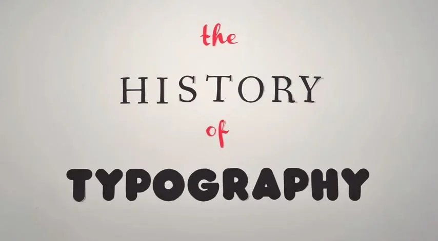
I find this simple stop-motion animation about the history of typography to be really charming. Created by Ben Barrett-Forrest of graphic design company Forrest Media, the clip is composed of 291 paper letters displayed in 2,454 photographs, and represents 140 hours of work.
What I find most appealing about Ben's work is that, in a time when digital typographic animations are so quick and easy to produce, he has taken the time to craft something by hand. In doing so, he has created an animation which is raw and imperfect, and in places somewhat clunky. But it also has a feeling of being real and tactile, a hand-crafted work of typographic animation which mirrors the origins of the medium it chronicles - the painstakingly hand-made and imperfect way in which type was made and arranged for printing.

The clip is informative and entertaining, but it is its raw imperfect charm which I find most appealing, and why I recommend that you give it a watch

Comment

Solus

Comment

Solus

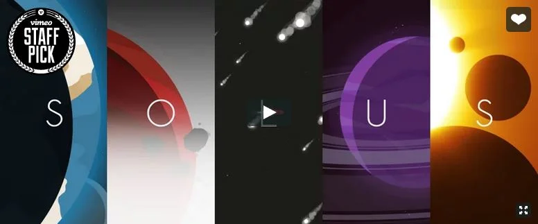
Despite its very simple graphic style, this animation from Identity Visuals is visually stunning, and surprisingly touching. I was immediately engaged with the piece and couldn't look away, something which I am finding occurs with ever decreasing frequency. Directed by motion designer Zac Dixon and, very importantly, with music from Cody Fry, Solus is a "short story of loneliness, adventure, and self sacrifice", and a beautiful one at that. Definitely worth 4 minutes of your life.

Comment